Gallery / Lines & time
line
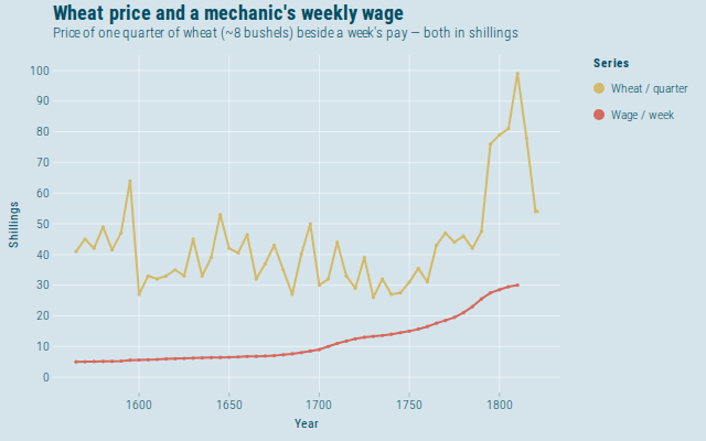
Wheat price and a mechanic's weekly wage
Playfair's 1821 levels chart: the price of one quarter of wheat (~8 bushels) and a good mechanic's weekly pay, both in shillings. Same currency, different baskets — he wanted you to eye the ratio, not add the series.
Source
Svelte, builder, JSON
<script lang="ts">
  import {
    GeomLine,
    GeomPoint,
    GGPlot,
    GuideLegend,
    Inspect,
    Labs,
    ScaleColorDiscrete,
    ScaleXContinuous,
    ThemeEconomist,
  } from "@ggts-sh/svelte";

  import { wheatAndWages } from "./data.js";
</script>

<GGPlot
  data={wheatAndWages}
  aes={{ x: "year", y: "value", color: "series" }}
  width={640}
  height={400}
>
  <GeomLine linewidth={2} />
  <GeomPoint size={1.6} />
  <ScaleXContinuous
    breaks={[1600, 1650, 1700, 1750, 1800]}
    labels="d"
    nice={false}
  />
  <ScaleColorDiscrete
    domain={["Wheat / quarter", "Wage / week"]}
    scheme="wsj_rgby"
  />
  <ThemeEconomist />
  <GuideLegend channel="color" focus />
  <Labs
    title="Wheat price and a mechanic's weekly wage"
    subtitle="Price of one quarter of wheat (~8 bushels) beside a week's pay — both in shillings"
    x="Year"
    y="Shillings"
    color="Series"
  />
  <Inspect mode="x" pin />
</GGPlot>
Meta
Details
- Family
- Lines & time
- Source
line/multi-series- Rendering
- SVG
- Techniques
Related